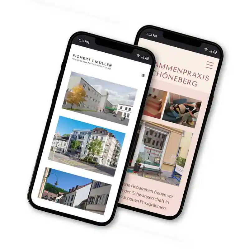
I work with clients in various sectors to develop or enhance their web presence. Utilizing either existing brand identities or establishing new ones, I design fully responsive websites with optimized functionality and cohesive UI. Depending on the client, I have also been responsible for developing a targeted brand system, photo-retouching and photo selection. Below are two examples.
(Note: websites may have been independently updated since hand-over.)
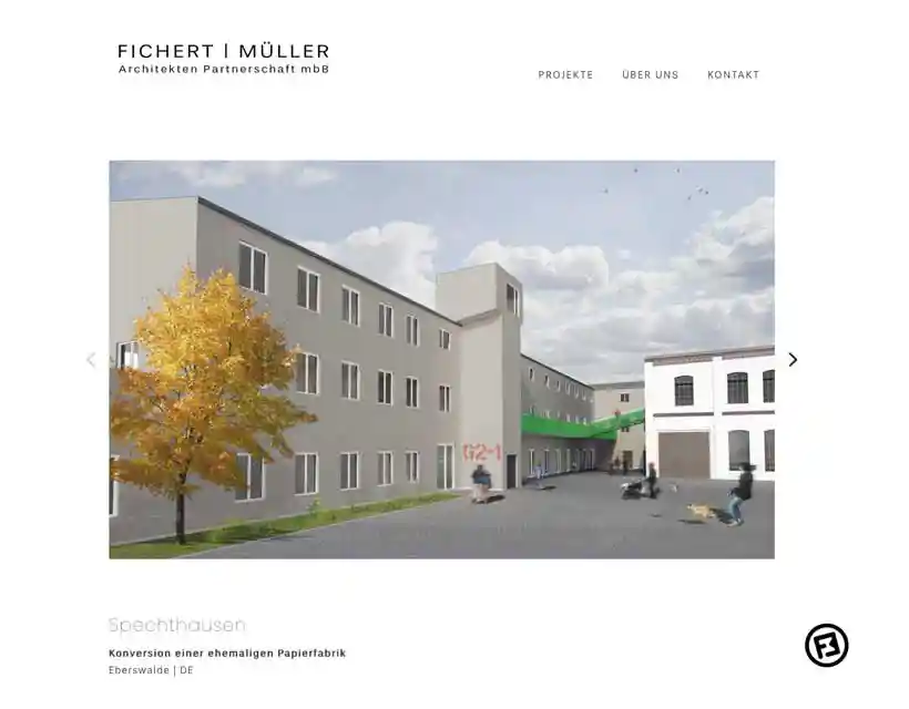
Task: Redesigned a legacy website that was hindering business opportunities due to poor performance and an outdated interface.
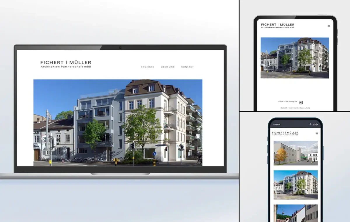
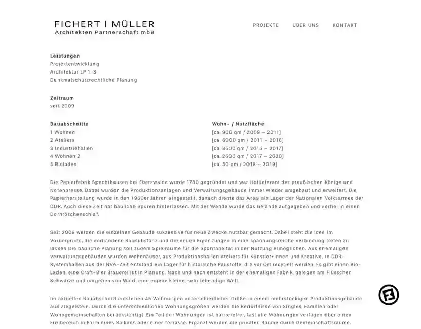
Solution: Created a high-performance, responsive WordPress site that’s UI mirrors the firm’s minimalist brand identity.
Implemented a sticky logo for constant brand visibility during scrolling.
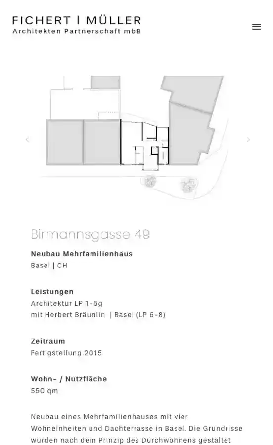
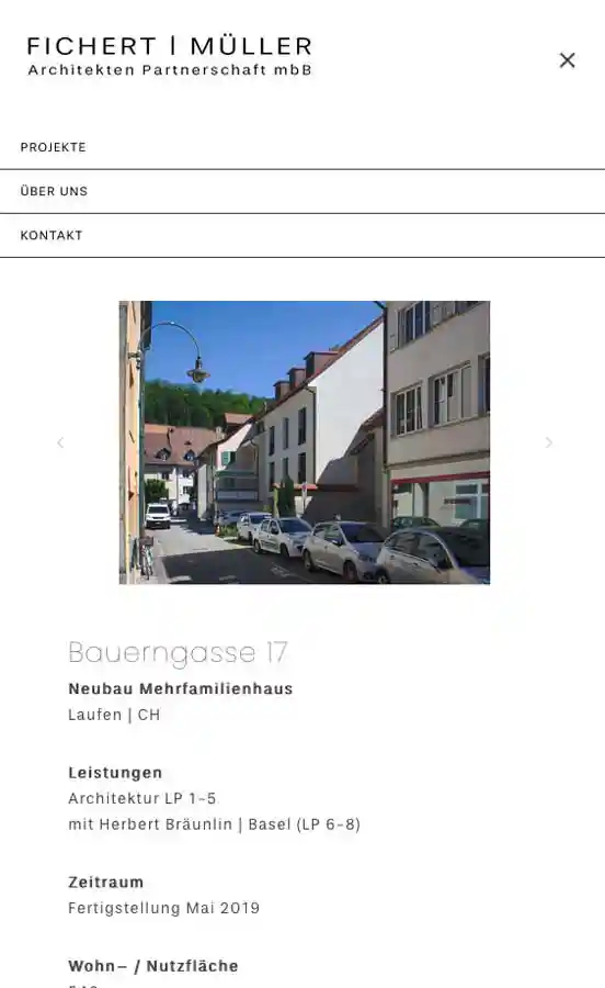
Created reusable template for project display
Curated high-fidelity image carousels for each provided project with properly optimized photos
Handoff: Created a set of digital guidelines so client could maintain the website and to ensure proper visual quality and functionality for future project uploads.
Impact: Increased firm visibility and leveraged professionalism to successfully obtain new contracts.
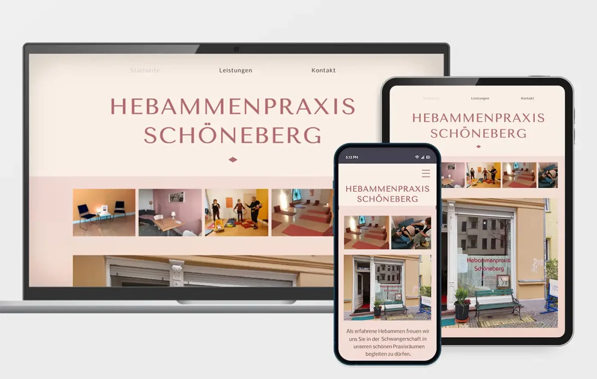
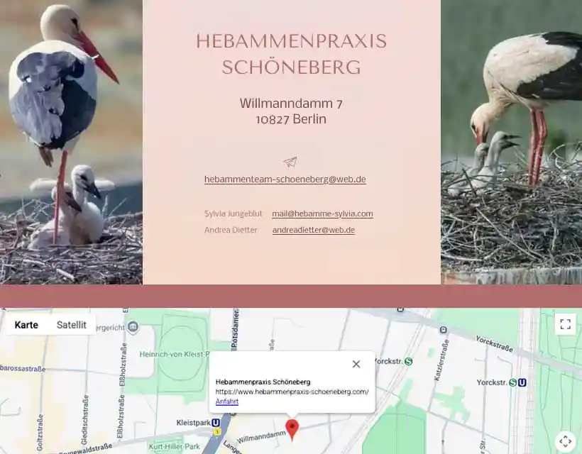
Task: Establish a full digital presence for a Berlin healthcare practice. Photographs and text provided but no existing branding assets given.
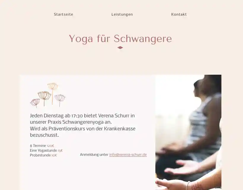
Solution: Created a ‘visual language’ for the website including colors, typography, and icons implemented across a fully responsive multipage website.
Visual strategy: To maintain an inclusive and accessible user experience, I developed a calming neutral color palette, for the mobile version the colors are higher contrast for better visibility. I chose slightly high-end typography paired with basic sans serif to balance professional authority with the personal nature of midwifery. For a more memorable experience I integrated some simple graphics to complement each service provided.
Asset management: Performed photo-retouching and optimization to ensure all visual content met high-fidelity web standards without impacting page load speeds.
Performance & visibility: Applied SEO and Google Business integration, resulting in high local search visibility ensuring the brand reached its widest audience via localized search.