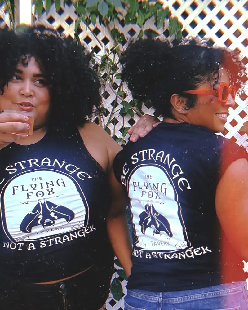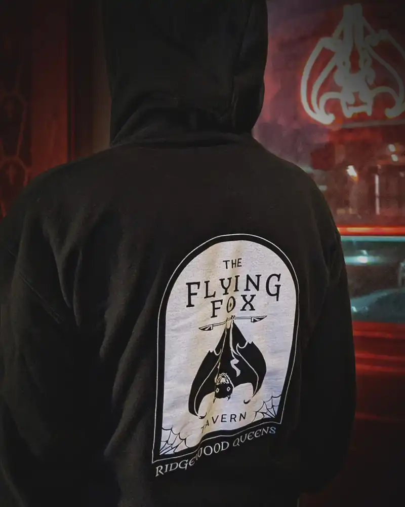



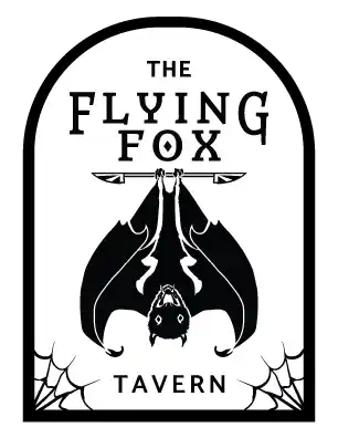


Logo Brief: include a ‘flying fox’ (a kind bat) central in the design, maintain the feel of a traditional tavern and incorporate a knife representing cooking.
My idea was to design/draw a bat that was both inviting yet keeping within the constrains of the horror theme, creating a wider audience appeal. Knives were introduce subtly and as many taverns signs use a coat of arms or wooden shape, I had the idea to contain everything inside a tombstone shape.

For a classic feel, I chose a minimal color palette with standout typography. As the bar is dark, too many colors would go unnoticed and not fit the feel of an old-world tavern.
For the typography, I chose a serif font that evoked an older time period and paired it with a sans-serif font for a more modern touch. The end result utilizes the structure of traditional tavern signage, classic horror elements and readable typography that can also function as a wordmark logo.